If you are a CEO, founder, CRO or marketing leader at a growing B2B company and your website is not producing pipeline, this guide is for you. Good B2B website design answers one question first: what must a buyer believe, find and do on this site before they talk to sales? Our guide to website performance covers this in more detail.
You will get a plain definition, the parts of a B2B website, how to plan strategy, messaging, content, structure, user experience, conversion, speed and measurement, and how to keep improving after launch. Each section links to a deeper guide, so you can go as far into any topic as you need. Our guide to website personalization covers this in more detail.
|
B2B Website Design B2B website design is the practice of planning a company website's strategy, messaging, structure, experience and measurement so that business buyers can evaluate a company and move toward a sales conversation. Our guide to website audit checklist covers this in more detail. |
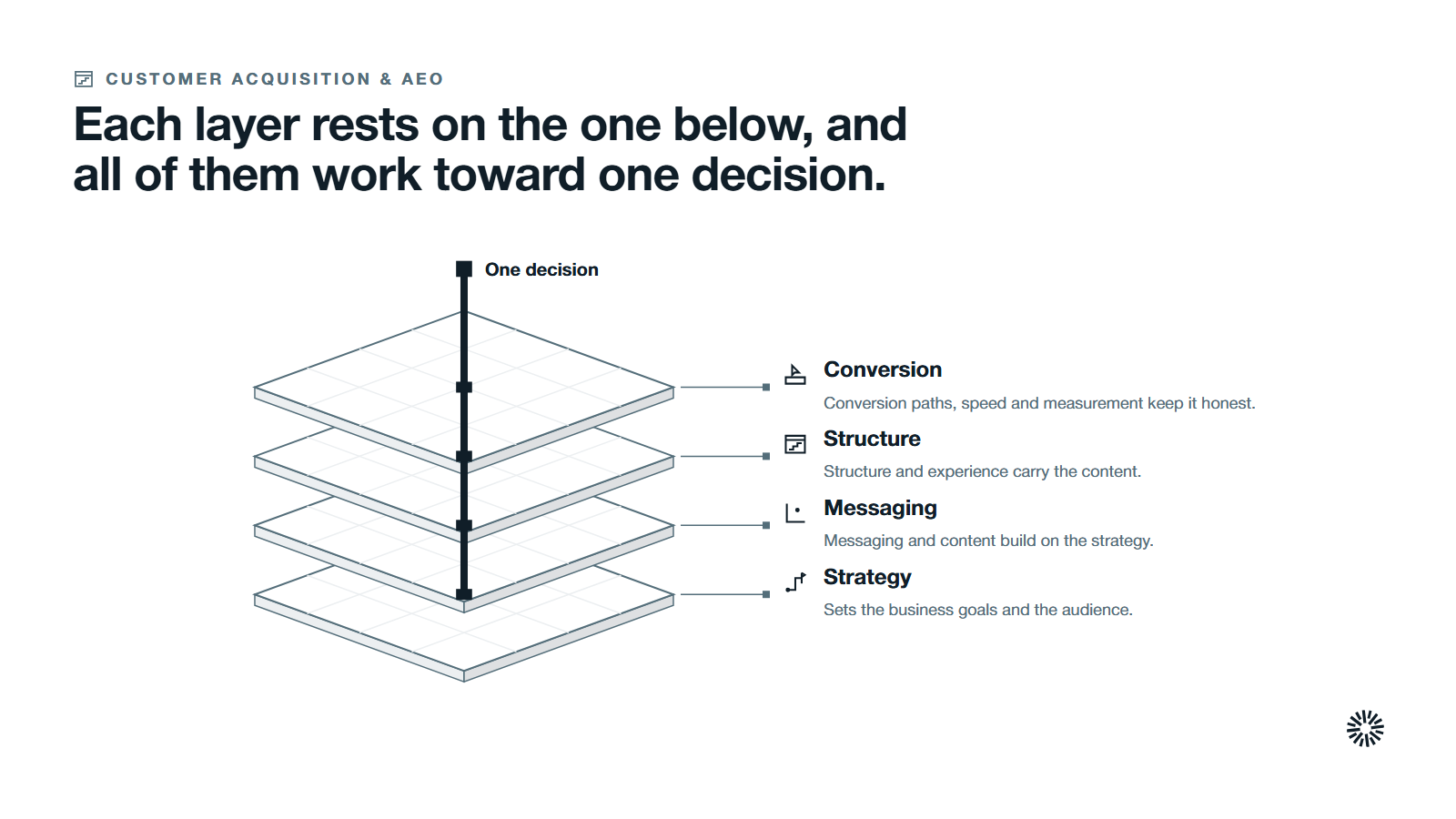
A B2B website is a system of layers that work toward one decision
A B2B website is not a brochure with a contact form. It is the place where a buying group checks whether you understand their problem, whether you are credible and what happens if they get in touch. Design decisions either help that check or get in its way. Our guide to website migration covers this in more detail.
Think of the work as layers that build on each other. Strategy sits at the bottom, because it sets business goals and the audience. Messaging and content sit on top of it. Structure and user experience carry the content. Conversion paths, speed and measurement keep the whole thing honest.
Skip a lower layer and the upper ones wobble. A beautiful home page cannot rescue a vague value proposition. A fast site with no clear next step still earns nothing. This guide takes the layers in the order you should decide them.
If you want the wider picture first, read our guide to go-to-market strategy. The website is one of its most visible parts, and the choices below should match it.
How B2B website design differs from B2C
The differences come from who is buying and how. A consumer often decides alone, in one session. A business buyer works with colleagues, over weeks or months, and has to justify the choice to people who never visit your site.
Forrester's State of Business Buying 2024 release says 13 people within an organization are involved in the average buying decision and 89% of purchases involve two or more departments. Your site has to serve a committee, not a single visitor.
B2B buyers also lean on logic and efficiency more than impulse, and sales cycles are typically longer than in B2C. So a B2B site educates instead of pushing urgency.
Where a consumer shop puts the price up front, a B2B site should still be transparent about specifications and how pricing works, so a prospect does not drift to a competitor with clearer answers.
Business buyers decide in a group and mostly before they talk to you
Understanding the buying group changes what you build. Each member arrives with a different question. The person who feels the problem wants to know whether you understand it. The person who pays wants proof and a sense of risk. The person who will use the product wants to know it will work.
Sales cycles are long, and much of the research happens without you. 6sense's 2025 B2B Buyer Experience Report, a global study of nearly 4,000 B2B buyers, found that the winning vendor was already on the buyer's Day One shortlist 95% of the time.
The same report puts the point of first contact with a seller at 61% of the buying journey. That means most of the evaluation happens on your website, in search results and in other places you do not control, before anyone fills in a form. Our guide to website analytics covers this in more detail.
So the site has to do the job of an early sales conversation. It should explain who you serve, show how you work and make the next step obvious to someone who is still comparing options and is not ready to talk.
Start with a website strategy tied to business goals
A website strategy is the set of decisions about what the site is for, who it serves and how you will know it is working. It comes before any design file. Without it, every later choice becomes a matter of taste, and the loudest opinion wins. Our guide to website strategy covers this in more detail.
Begin with business goals. Decide whether the site must generate new leads, support an account-based sales motion, shorten sales cycles, recruit partners or reduce the questions your sales team answers by hand. Pick one primary goal and at most two supporting ones.
Then turn each goal into a measure you can read from a system you already use. A goal such as more qualified demo requests from your target accounts can be tracked. A goal such as a better online presence cannot.
Define the target audience in terms a designer can use
Write down the kind of company you serve, the trigger that makes it look for help and the roles involved in the decision. Include the potential customers you want and the ones you do not. This keeps the site from trying to speak to everyone.
Add the questions each role asks, in their own words. Those questions become the raw material for your messaging, your navigation and your content. Address the frustrations and goals of each decision-maker directly, and the site starts to feel written for them.
Audit the existing site before you plan a new website
If you already have a site, start by learning what it does. Review traffic sources, the pages that produce leads, the pages that lose people and the content that sales actually uses. An honest audit of the existing site shows what to keep, what to fix and what to remove.
Our guide to the inbound-ready website lists the features that turn visitors into leads and gives you a way to test your site against them today.
Done looks like this: a one-page strategy with the primary goal, the audience, the measures and a list of what the audit found.
Write a value proposition and brand messaging buyers can repeat
A value proposition states the result a buyer gets, for whom and why you are the better route to it. It is the first thing a visitor should understand, and it should be clear enough that a buyer can repeat it to a colleague without opening your site again.
Brand identity supports the message but cannot replace it. Colors, type and imagery shape how credible you look. They do not tell a visitor what you do, who it is for or why it matters. Decide the words first, then the visuals that carry them.
Write the promise at the top, then three supporting messages, with the proof under each. State your competitive advantage in plain terms, as the reason a buyer should pick you over other businesses in the same market.
Lead with what changes for the buyer, and put features second. A buyer wants to know what is different afterward and only then how it works.
Test the message before you design around it
Show the home page headline and the first paragraph to five people in your target audience and ask what the company does and who it is for. If their answers drift from your intent, the message needs more work. This costs an afternoon and saves a rebuild.
Keep the result in a short message document that sales, marketing and customer success can all use. When the site, the sales deck and the emails use the same words, buyers hear one story.
Plan a website content strategy around buyer questions
A website content strategy decides what the site will say, in what order, for which role and at which stage of the buying process. It turns your messaging into pages and keeps the right content findable. Good B2B content answers a real question better than any other page on the internet.
A content strategy is the plan for creating, publishing and maintaining that content so that it matches your business goals and your audience. Done well, it lifts website traffic and engagement because every page has a reason to exist.
Start from the questions you collected. Group them by stage: what is the problem, what are the options, how do we choose and what happens after we sign. Give each group a home on the site, with the right content for that visitor and a clear next step.
Cover the basics first. Your service or product pages, your pricing approach, your process, your case studies and your about page carry most of the weight. Add resources, such as guides and comparisons, that help people who are not ready to buy.
Social proof belongs inside this plan, not on a separate page that nobody visits. Place customer stories, client logos with permission, industry certifications and specific outcomes next to the claims they support.
Case studies with measured results build the most trust, so use only results you can show and keep the source on file.
Match the content to user intent and the right traffic
User intent is the reason behind a search or a click. Someone searching for a definition wants an explanation, someone comparing options wants criteria, and someone ready to act wants a clear route. Write each page for one intent, and the right traffic tends to find it.
Long-tail topics, which are specific phrases such as a role, an industry and a problem together, bring fewer visitors but more relevant ones. Social media marketing and email can carry your best pages to the same audience, though the site remains the home for the full answer.
Make the content plan visible in the site structure
Plan internal linking while you plan content. Each page should point to the next most useful page, so a visitor can follow a path from a broad question to a specific answer. Internal links also help search engines understand how pages relate.
Treat a content strategy as a living plan with an owner and a review date. If nobody owns it, the content ages and the site slowly stops answering the questions buyers ask. Keep content quality high by retiring pages that no longer earn their place.
Design the site structure and primary navigation around buyer tasks
Structure is how the site is organized and how a visitor moves through it. A buyer arrives with a task, such as checking whether you serve their industry, finding pricing logic or finding proof. The structure should let them complete that task in a few clicks.
Keep the primary navigation short. Label items with the words buyers use, not internal terms. Four to seven top-level items is usually enough for a B2B site, with deeper pages grouped beneath them.
Give the home page a clear job. It should tell visitors who you are for, what you do and where to go next, and it should route different roles to the right section. It is a signpost, not a place to say everything at once.
Support the whole buying journey, from first research to the sales conversation. Larger sites also benefit from a useful internal search, and technical buyers expect easy access to documentation and integration details so they can check fit without waiting for a call.
Plan the page types before you design any of them
Most B2B sites need the same page types. Decide each one's purpose, its main message and its single next step before design starts:
- Home page: states the value proposition and routes visitors to the right section.
- Service or product pages: explain the offer, who it is for and the proof behind it.
- Industry or use-case pages: speak to a specific segment in its own language.
- Case studies: show a documented outcome with the client's approval.
- Resources: answer questions earlier in the journey.
- About and contact pages: build trust and make it easy to start a conversation.
Done looks like this: a sitemap on one page, with a purpose and a next step written beside every page type.
Apply web design and UX principles that reduce effort
User experience is how the site feels to use. The user interface is the layer a visitor touches, such as buttons, forms, menus and layout. Strong web design makes both easy and makes life easy for busy buyers, who leave sites that make them work.
A better user experience also lifts the customer experience that follows, because the site sets the first impression of working with you.
Our explainer on UX design covers the parts of the discipline and how it connects to search and conversion. For a hands-on route, the guide to designing for the user experience walks through research, prototype and testing.
A short checklist covers most of the value: Our guide to website redesign checklist covers this in more detail.
- Clarity: each page has one main message and one main action.
- Consistency: buttons, headings and spacing behave the same on every page.
- Hierarchy: the most important element is the most prominent one.
- Readability: text is large enough, contrast is strong and lines are short.
- Feedback: forms and buttons show what happens next.
- Accessibility: people using keyboards or screen readers can complete the same tasks.
On readability, the W3C's Web Content Accessibility Guidelines require a contrast ratio of at least 4.5:1 between text and its background for normal text. Meeting it helps everyone, including people reading on a phone in sunlight.
Visual appeal matters when it serves the message
A professional look earns trust, and a user friendly layout keeps people reading. But visual appeal is not the goal. Test any design choice by asking whether it helps a buyer understand, trust or act. If it only decorates, remove it.
Build conversion paths and lead generation into every page
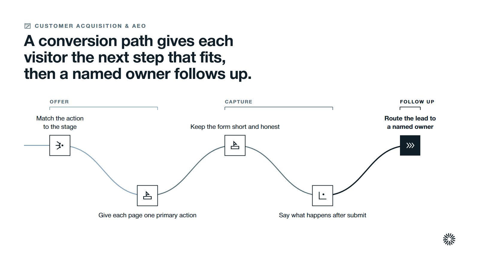
Conversion is any action that moves a visitor toward revenue: a demo request, a download, a call booking or a newsletter sign-up. Lead generation depends on giving visitors the right action at the right moment, not on a single form at the end.
Match the action to the stage. Someone reading an educational guide is not ready for a sales call, so offer a related resource. Someone on a service page is closer, so offer a conversation.
Every page should have one primary call to action and, at most, one quieter alternative. Use action-oriented wording that says what the visitor gets, and offer several conversion points across the site so each buyer finds a step that fits where they are.
Keep forms short and honest, because lead capture forms convert better when they ask only for essential information. Ask for what sales needs to follow up and nothing more, say what happens after the visitor submits and route the lead to a named owner.
A lead that sits unanswered turns a good design into a wasted one.
Our guide on how to optimize your website for leads gives ten ordered steps, from shorter forms to follow-up that sales trusts.
Improve conversion rate with a repeatable process
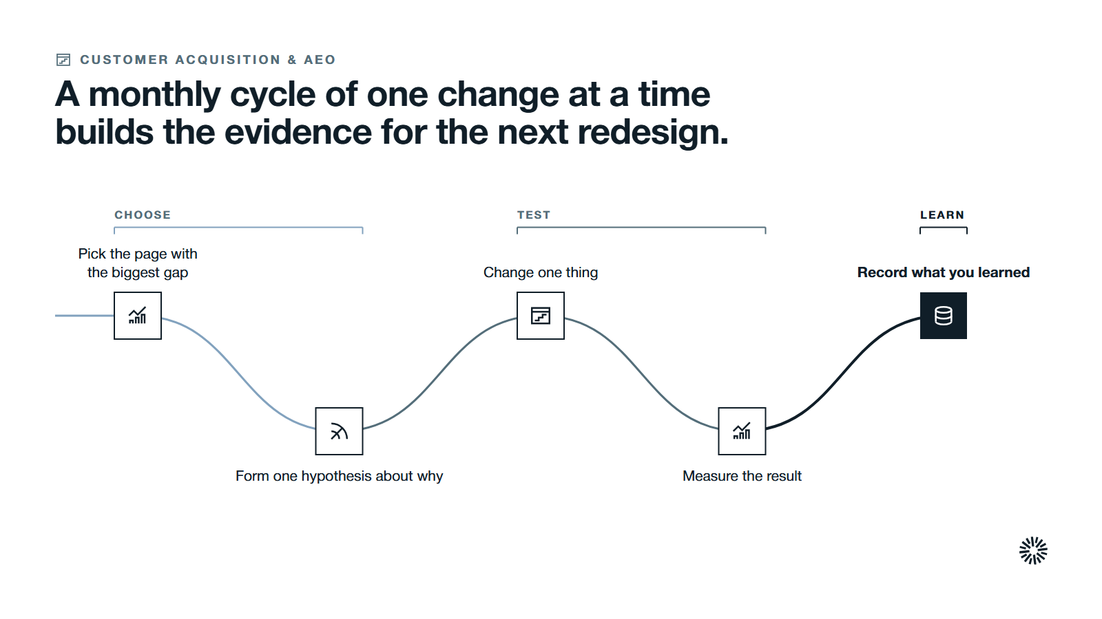
Conversion rate optimization is the process of raising the share of visitors who take a desired action. It works best as a cycle: measure, find the biggest drop-off, form a hypothesis, test one change and keep what wins.
If you have never run a test, our guide to getting started with CRO sets out a baseline, a ranked test list and a first experiment. To see what a tested page looks like, read the conversion rate optimization examples built around one B2B demo page.
Start with the pages closest to revenue, because a small gain there is worth more than a large gain on a page few buyers read.
Make the site fast, accessible and ready for mobile devices
Performance is part of design. A slow or unstable page erodes trust before the first sentence is read. Decision-makers frequently research on phones and tablets, often between meetings, so responsive design that works across mobile devices matters as much as the desktop layout.
Fast load times also keep the bounce rate down and the experience smooth.
Google's web.dev guidance on Core Web Vitals sets recommended targets: Largest Contentful Paint within 2.5 seconds, Interaction to Next Paint of 200 milliseconds or less and Cumulative Layout Shift of 0.1 or less, measured at the 75th percentile of page loads.
Mobile matters for search as well. Google's mobile-first indexing documentation says Google uses the mobile version of a site's content for indexing and ranking. If your mobile pages hide or drop content, your rankings can suffer.
Protect performance as the site grows
Most speed problems come from oversized images, heavy scripts and layout that shifts as the page loads. Set a performance budget, check it when you add a feature and test on a mid-range phone, not only on a fast office connection.
Plan for accessibility at the same time. Alt text, readable contrast, keyboard navigation and clear form labels are cheaper to build in than to retrofit.
Prepare the site for search engines and AI answers
Search engines and AI answer tools are often where a buyer first meets your content. Organic search brings the right traffic when the site is clear about its topics, structured well and useful enough to earn links and mentions.
Google's guidance on people-first content tells creators to write for the people they want to help, not to manipulate rankings. That fits B2B well: specific, expert pages that answer a real question tend to serve both readers and search.
AI summaries change how people use results. A Pew Research Center analysis of the March 2025 browsing of 900 US adults found that users clicked a traditional result link in 8% of visits with an AI summary, against 15% of visits without one.
The lesson is to make the answer on your page easy to extract: a clear heading, a direct answer in the first sentences, then the detail. Pages built this way serve people who read them and tools that summarize them.
Cover the technical basics
Plan keywords around real questions and use long-tail phrases where they fit the page. Give every page a unique title and description, a logical heading order and descriptive link text.
Keep URLs readable, fix broken links, add a sitemap and make sure important pages can be crawled. These basics rarely win on their own, but missing them can cost you everything else.
Measure website performance with a few metrics tied to decisions
A website produces a lot of numbers. Most of them do not change a decision. Choose a short set that answers four questions: who arrives, whether they engage, how the site performs and whether visitors convert into pipeline.
Our guide to website metrics explains the four groups and how to read them. Google Analytics is a common place to track traffic and engagement, and Google's help page on engagement rate and bounce rate defines bounce rate as the percentage of sessions that were not engaged.
Keep an eye on bounce rate, but read it with context: a short visit that answers a question is fine. Do not stop at traffic. Website traffic counts people who arrive. Conversion rate counts people who act.
Pipeline and revenue count what those actions were worth. Connect the website to your CRM so each lead carries its source, page and campaign through to a closed deal.
Set targets and a review rhythm
Agree a baseline before launch and a target for each measure. Review a few measures weekly, the full set monthly and the strategy quarterly. A number that nobody reads on a schedule might as well not exist.
Add a business metric to the list, such as marketing-sourced pipeline or the share of deals that touched a key page. Metrics like these show whether the website supports the business goals set at the start.
Improve the site continuously instead of rebuilding it every few years
The traditional redesign bets everything on one launch. You spend months building, launch, and then find out what works. By then the market has moved, and the launch may be built on guesses.
Growth-driven design takes a different route. It launches a focused site quickly, then improves it in short cycles using evidence from real visitors. Our guide to growth-driven design explains the stages, and the comparison of growth-driven design vs a traditional redesign helps you choose between them.
For practical ideas, see these examples of growth-driven design applications, such as device analysis, navigation changes and personalized content.
Neither route is always right. A site with broken foundations may need a full rebuild. A site with sound foundations improves faster through steady, measured changes. Decide with evidence from your audit, your goals and your capacity to run tests.
Run a simple monthly improvement cycle
Each month, pick the page or flow with the biggest gap between traffic and conversions. Form one hypothesis about why, change one thing, measure the result and record what you learned. Small, documented changes compound, and they build the knowledge to guide the next redesign if you ever need one.
Build a new website in a sequence that protects launch day
If you do need a new site, order the work so that each step feeds the next. A sensible sequence has seven stages:
- Goals and audit: agree the business goals and review the existing site.
- Audience and message: define buyers, questions and the value proposition.
- Content and structure: plan page types, sitemap and the content each page needs.
- Design and prototype: create wireframes and test them with real users before building.
- Build and connect: develop the site, connect forms to your CRM and set up tracking.
- Test and prepare: check speed, accessibility, links, redirects and forms on every device.
- Launch and learn: release, watch the measures and plan the first improvement cycle.
Redirects deserve special care. If you change URLs, map every old page to its closest new page so you keep your rankings and links. A website launch that loses its search history can undo months of work.
Brief sales and customer success before the website launch. If the first person a buyer meets cannot explain what the site promises, the design has failed where it counts.
Study examples of B2B websites, then borrow the principles and not the layout
Looking at other websites is useful when you ask why a page works, not what it looks like. Learn from other businesses and other websites in your market, and from sites outside it.
A great example usually does three things: it states who it is for in the first screen, it offers proof near the claim and it gives one obvious next step.
Our collection of websites built with HubSpot's CMS shows real sites from different industries. Use examples like these for inspiration and to spot patterns, including how they show dynamic content, such as a case study chosen by industry, then check each idea against your own audience and goals.
Avoid copying a competitor's structure wholesale. You do not know their goals, their data or whether the page performs. Borrow the principle, test it on your own site and keep it only if your numbers agree.
Common B2B website design mistakes and how to avoid them
A few mistakes cause most of the damage, and each has a simple prevention.
Designing before the strategy. A new look on an unclear message produces a better-looking confusion. Settle the goal, the audience and the value proposition first.
Writing for yourselves. Internal jargon and product names mean little to a buyer. Use the words your customers use, and test them.
Hiding the next step. If visitors cannot see what to do next, most will leave. Give each page one clear action.
Treating mobile as an afterthought. Many buyers read on a phone. Design and test there first.
Launching without measurement. If tracking is not in place on launch day, you lose the first weeks of learning. Test forms and events before release.
Treating launch as the finish. A website is never done. Plan a review rhythm and an owner for improvements from the start.
Disconnecting the site from the CRM. If leads arrive without their source, sales cannot prioritize and marketing cannot learn.
What you gain when this is done properly
When strategy, messaging, structure, experience and measurement are decided in order and reviewed on a schedule, the website stops being a project and becomes a working part of the revenue process. Each team feels the difference.
Sales gets better conversations from the site
Sellers meet buyers who have already seen the proof and understood the offer. Leads arrive with their source and the pages they read, so the first call can start from what the buyer cares about. Fewer meetings are spent explaining the basics.
Marketing can show which pages create pipeline
Marketing works from a plan, a message and a short set of measures. Budget and effort follow evidence, and the team can show which pages and campaigns produced qualified leads and which only produced traffic.
Customer success inherits clearer expectations
Because the site says what you do and for whom, new customers arrive with realistic expectations. Onboarding starts from a shared understanding, the customer experience begins on a firmer footing, and the questions customers ask feed back into the content that helps the next buyer.
Treat the website as the center of a connected go-to-market system
A B2B website works best when it is wired into the rest of your go-to-market system. The forms feed the CRM, the content supports sales, the data reports back to marketing and the improvements follow what customers do.
Propello designs and builds connected go-to-market systems on HubSpot for CEOs and revenue leaders at growing B2B companies, and Propello is a HubSpot partner (see our about page). If you want a second pair of eyes on your website and the systems behind it, an audit is the place to start.