
If you lead revenue at a growing B2B company, HubSpot dashboards are where your team's numbers should meet in one view, so you can see pipeline, activity and customer acquisition without asking anyone for a spreadsheet. A good dashboard answers one question for one person, and then gets reviewed on a schedule.
This article is for CEOs, founders, CROs and sales and marketing leaders who already have HubSpot dashboards and do not trust or use them. You will get a definition, the data that must be right first, the dashboards to build by role, the metrics with formulas, and a weekly, monthly and quarterly routine.
|
HubSpot Dashboard A HubSpot dashboard is a single view that groups reports from your HubSpot account, so a person or team can analyze CRM data for one purpose, such as sales performance or campaign results. |
A good HubSpot dashboard answers one question for one person
Does HubSpot have a dashboard? Yes, and you can build several. The harder question is what belongs on each one. HubSpot describes a dashboard as a way to organize your reports into one view and to analyze data specific to a certain purpose or user. Purpose and user are the two decisions that matter.
HubSpot's reporting gives you the parts: standard reports, custom reports and a dashboard to hold them. Effective HubSpot reporting starts with the question, then the report, then the dashboard. A dashboard earns its place when it produces actionable insights, meaning a number that tells someone what to do next.
A dashboard that works has five traits:
- It has one owner and one audience, such as the sales team or the executive team.
- Every report on it answers a question that someone asks every week.
- The metrics use agreed definitions, so two people reading it reach the same conclusion.
- The data behind it is complete enough to trust.
- Someone reviews it on a fixed schedule and acts on what it shows.
If a dashboard fails the first trait, it becomes a wall of charts that nobody owns. Multiple focused dashboards beat one crowded screen, because each person finds their numbers in seconds.
A good dashboard also turns key performance indicators into charts and graphs, which removes the need to compile data across spreadsheets by hand. Keep it to a handful of indicators, not a long list.
A report and a dashboard are not the same thing. A report focuses on specific metrics and supports deeper analysis of data points, and it is built from your HubSpot CRM data.
A dashboard combines multiple reports, plus filters and notes, into one visual interface for one reader, and it suits day-to-day tracking. Our guide to the marketing KPI dashboard shows how that thinking applies to the marketing side.
Fix the data before you create dashboards
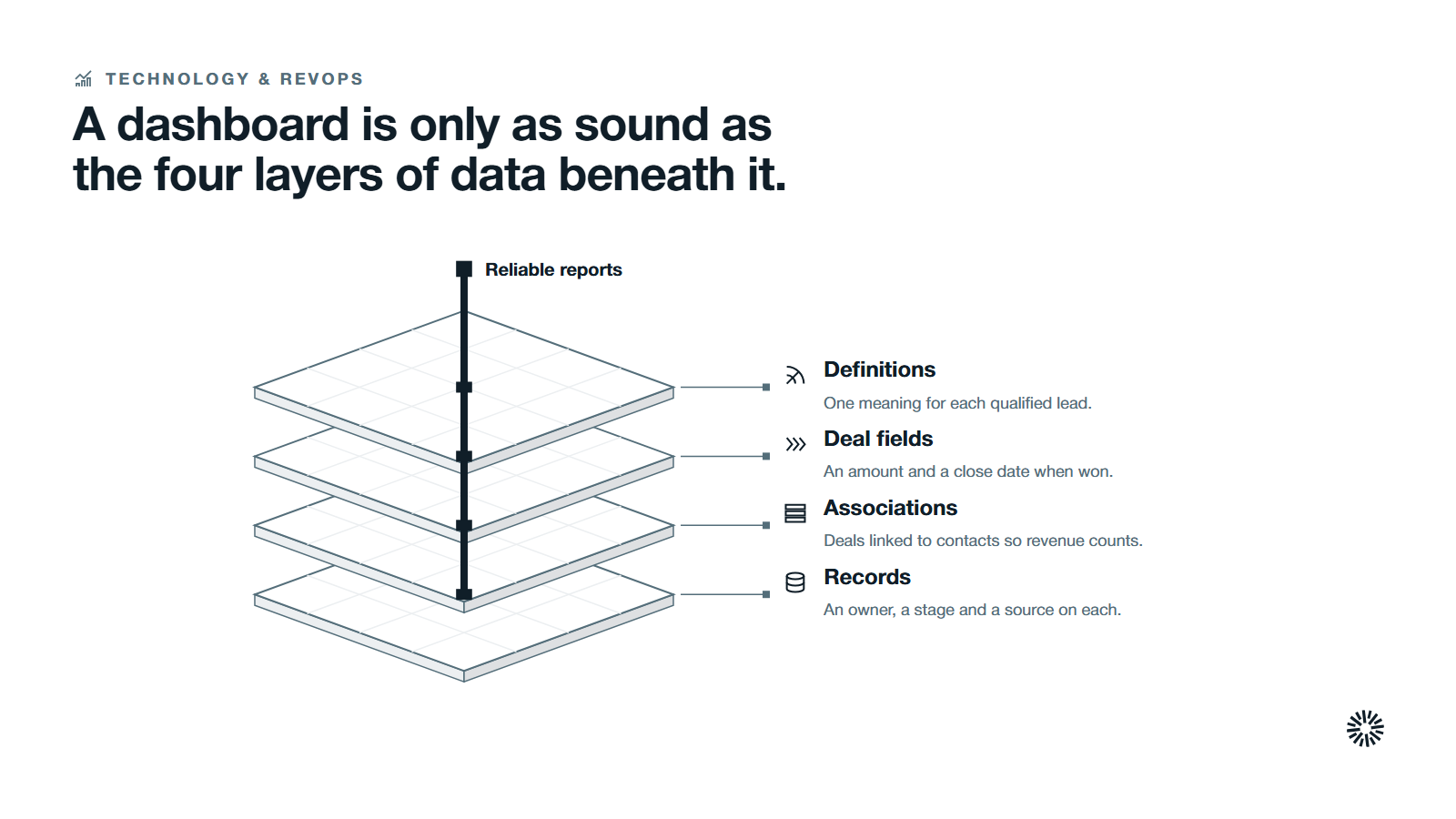
A dashboard shows what your records say. It pulls data from the contacts, deals and website activity in your HubSpot account, so if the records are thin, the dashboard is wrong with confidence. Check four layers first, from the bottom up.
Records come first. Contacts, companies and deals need an owner, a lifecycle stage and a source. Our guide to HubSpot lifecycle stages explains how to set the stages up so that reports can count them. If the foundation is already messy, start with how to clean and maintain a HubSpot CRM.
Associations come second. HubSpot's page on attribution reporting says the deal needs to be in a closed-won stage, and that without an associated contact the revenue will not be attributed to any interactions. A deal with no contact is invisible to revenue reporting.
Deal fields come third. Closed-won deals need an amount and a close date, or revenue and cycle reports undercount. Manual data entry is the usual cause of gaps, so make the fields required in the pipeline or fill them by automation.
Definitions come last. Agree what counts as a marketing qualified lead, a sales qualified lead and a customer before anyone builds a chart. If sales and marketing use different definitions, the same metrics will produce two arguments instead of one answer. Our revenue attribution guide covers how to credit the work that closed a deal.
Build HubSpot dashboards by role, not by department
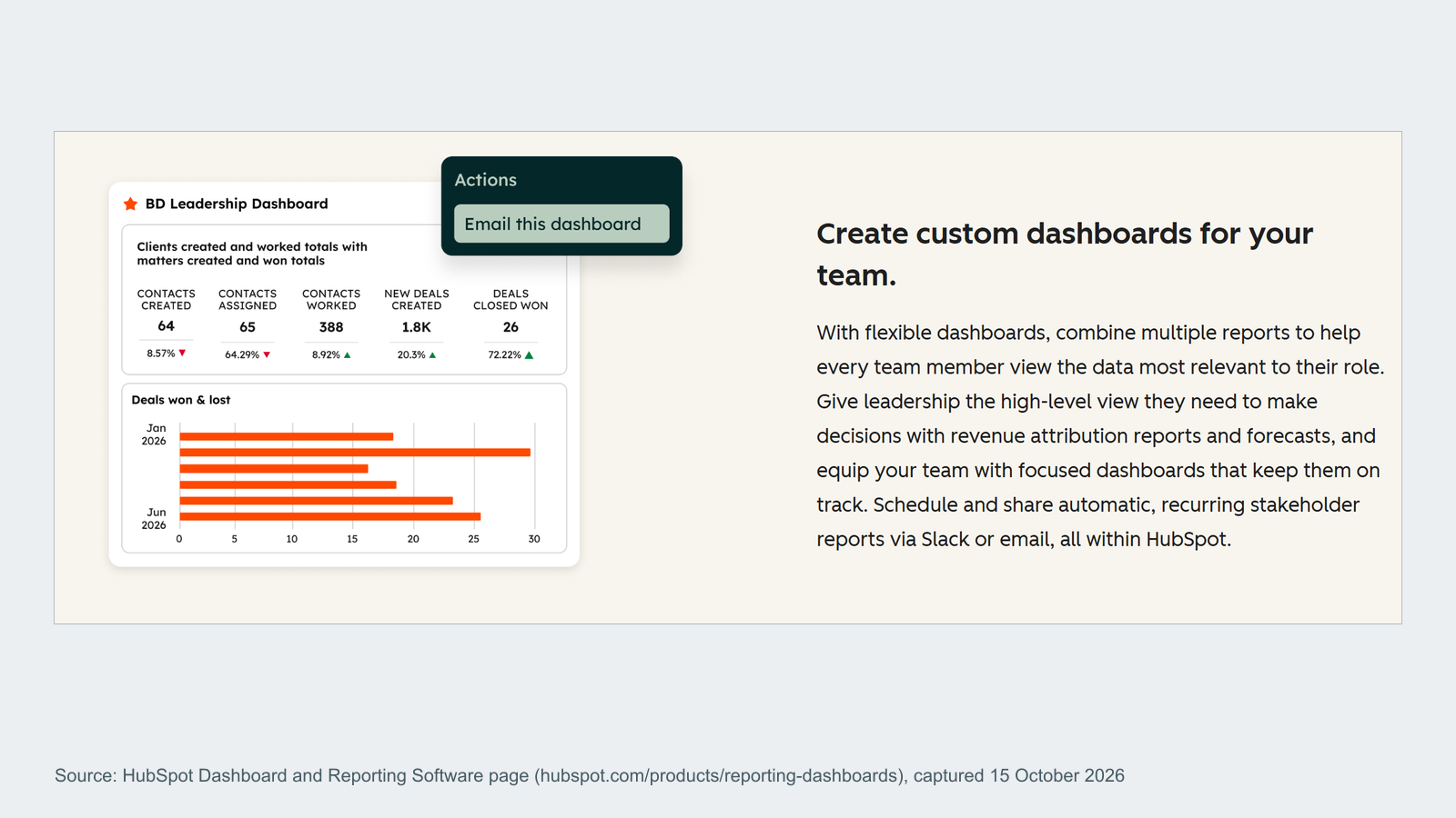
Different people ask different questions of the same pipeline. HubSpot dashboards work best when each one is built for a role, with a short set of reports.
How to create dashboards in HubSpot
HubSpot's page on how to create, clone, delete and manage dashboards gives the path. Go to Reporting, then Dashboards, and click Create dashboard. You can choose a pre-made dashboard template, which HubSpot currently marks as beta, or a blank dashboard with no reports.
Name it for the audience and the purpose. HubSpot does not allow a website URL or a period in the name. Then set who in your HubSpot account can see it: private to the owner, or everyone with view and edit or view only. HubSpot also offers a granular option by team and user.
A dashboard is made of modular reporting cards that you can rearrange or filter. Add reports from the reports list with the Actions menu and Add to dashboard, or from the right side panel of the dashboard.
HubSpot's page on customizing your dashboard says you can drag a report to move it and resize it from its bottom right corner. Use the dashboard layout to put the answer to the main question in the top left.
HubSpot also says to filter the data to a specific date range, specific owners or teams, or specific pipelines, for better analysis.
Start from a dashboard template, then tailor dashboards to your process
A dashboard template gives you a starting layout. Treat it as a draft: swap reports, set filters for your pipeline and team, and delete anything no one will read. If no HubSpot dashboard template fits, a blank dashboard is faster than bending a template.
To build dashboards that last, tailor dashboards to your sales process, not to the template's idea of one. Custom dashboards are simply dashboards where every report was chosen on purpose.
Create custom reports for the questions standard reports miss
When the standard reports cannot answer a question, create custom reports. Building custom reports lets you combine data from related records, such as deals with their companies, and save the result to a dashboard. Keep each custom report tied to one decision.
The revenue leader's dashboard
An executive dashboard gives a high-level view of business performance, while rep and manager dashboards go deeper. Tailoring by role gives macro and micro views of the same pipeline.
A revenue leader needs a small number of outcomes in one view: closed-won revenue against goal, pipeline by stage, forecast, and the split of revenue by source.
HubSpot's page on reporting on goals says a saved goal report can be added to a dashboard, and its summary shows the goal target against the actual progress.
Add the forecast and deal revenue by source from the sales analytics reports, and you have forecasted revenue and revenue outcomes side by side.
The HubSpot sales dashboard
A sales performance dashboard serves sales managers first and sales reps second. Used well, it shows sales performance for the whole sales team and keeps the sales pipeline in one place.
HubSpot's page on the sales analytics suite lists reports such as deal funnel, deal velocity, sales velocity, time spent in deal stage, deals won and lost, deal loss reasons, quota attainment and team activity.
Together they cover the sales pipeline, sales activities and team performance, which are the key sales data a manager needs.
Give managers the funnel, the slow deals and the loss reasons. Give each sales rep a view of their own deals and tasks. Individual performance metrics belong on the rep's dashboard and a team roll-up on the manager's, so the same metrics are never argued from two different screens.
The marketing dashboard
A marketing dashboard should end at revenue, not at clicks. Put lead volume by source next to the leads that became opportunities, and then next to the deals that closed. Lifecycle stage progression in HubSpot measures the conversion rates between stages, from lead to marketing qualified lead, sales qualified lead and customer.
HubSpot's page on creating custom reports describes the custom report builder, which lets you analyze a primary data source with related objects or data sources.
That is how marketing efforts get tied to customer acquisition metrics rather than to form fills alone. Attribution reporting then shows which channels drive revenue instead of traffic that only looks good.
The service dashboard
If customer success or support reports to you, give them their own dashboard with service data, such as ticket flow, response and resolution, and customer satisfaction. Keep it separate. Mixing service metrics into a sales dashboard hides both.
| Dashboard | Main question | Reports to start with | Reviewed by |
|---|---|---|---|
| Revenue leader | Will we hit the number? | Goal progress, forecast, revenue by source | CEO, CRO |
| Sales manager | Where is the pipeline stuck? | Deal funnel, time in stage, loss reasons | Sales leaders |
| Sales rep | What do I do today? | My open deals, tasks, activity | Each rep |
| Marketing | Which sources create customers? | Leads by source, conversion, deals by source | Marketing lead |
| Service | Are customers getting answers? | Service metrics, feedback | Customer success lead |
The key metrics to put on a dashboard, with formulas
Choose a few key metrics per dashboard, framed as key performance indicators, and write down how each one is calculated.
The arithmetic below uses one invented quarter and is illustrative, not a benchmark: 40 closed-won deals out of 100 closed, a closed-won value of $600,000, $90,000 of sales and marketing spend, and an open pipeline of $1,500,000 against a remaining target of $500,000.
Win rate
Win rate shows how many opportunities become customers, and it is among the most useful conversion rates a sales leader can track.
Formula: win rate = closed-won deals / all deals closed in the period x 100
Illustrative arithmetic: 40 won of 100 closed (won plus lost) gives 40%. Count only deals that reached a final outcome.
Sales cycle length
Sales cycle length is the average time from deal creation to close. A rising number is a leading indicator that deals are stalling.
Formula: sales cycle length = total days from create date to close date for won deals / number of won deals
Illustrative arithmetic: 2,400 days across 40 won deals gives an average of 60 days.
Pipeline coverage
Pipeline coverage tells you whether there is enough open pipeline to reach the target.
Formula: pipeline coverage = open pipeline value / remaining target
Illustrative arithmetic: $1,500,000 / $500,000 = 3. Whether 3 is enough depends on your own win rate, so read the two together.
Average deal size
Formula: average deal size = closed-won revenue / closed-won deals
Illustrative arithmetic: $600,000 / 40 = $15,000.
Customer acquisition cost
Customer acquisition cost shows what it costs to win a customer, and it is one of the critical metrics for budget decisions.
Formula: customer acquisition cost = sales and marketing spend / new customers
Illustrative arithmetic: $90,000 / 40 = $2,250.
Lead-to-customer conversion rate
Formula: lead-to-customer conversion rate = new customers from leads created in a period / leads created in that period x 100
Illustrative arithmetic: 40 customers from 1,000 leads gives 4%. Track the stage before it too, such as marketing qualified lead to sales qualified lead, to see where the leak sits.
Blank-source share
This data quality metric shows how much of your revenue the system cannot trace to a source.
Formula: blank-source share = closed-won deals with no source / all closed-won deals x 100
Illustrative arithmetic: 6 of 40 deals with no source gives 15%. If the number is high, fix the records before you compare channels.
Know the limits before you trust a dashboard
HubSpot's reporting has edges, and so do HubSpot dashboards. Name them so nobody mistakes a gap for a result.
- Access follows the data. HubSpot says dashboard access does not override individual report sharing, report folder permissions or the data permissions each report needs. A person can see a dashboard and still see a blank card.
- Dashboard limits depend on your account. HubSpot ties the maximum number of dashboards to your subscription, so check your own limit before you plan a dashboard library.
- Data is not always live. HubSpot says you can refresh the reports on a dashboard to see the most up-to-date data, and that custom reports refresh about every two hours.
- Sharing leaves filters behind. When you email a dashboard, HubSpot's page on sharing and exporting dashboards says the email will not include dashboard filters unless you choose to send with the current ones.
- Recurring emails carry the sender's permissions. Data in a recurring dashboard email follows the permissions of the person who set it up. To give each person only their own data, each person should set up their own email.
- Models change the answer. Attribution models distribute credit differently, so the same deals can credit different sources in different reports.
Sensitive data needs the same care. Decide who may see compensation, quota and customer details before you share a dashboard widely.
When the question needs multiple data sources, such as spreadsheets or tools outside HubSpot, or a join that HubSpot reporting cannot make, a business intelligence tool is the next step. Start with what the CRM can already do. Most teams have not used it fully.
A weekly, monthly and quarterly routine keeps dashboards honest
HubSpot dashboards that no one reviews go stale. Put the reviews in calendars, with names against them.
Weekly
Sales managers review the pipeline dashboard in the team meeting: new deals, stalled deals, next steps. Check the activity report for sales activities that are falling behind. Each rep opens their own view before the meeting. Marketing checks lead volume and source quality against the week before.
Schedule the dashboard to arrive by email before the meeting, so stakeholders read the same numbers without anyone compiling a report by hand.
Monthly
Revenue leaders review win rate, sales cycle length, pipeline coverage and customer acquisition cost for deals closed in the month. Check blank-source share and ask sales to fix records with a missing amount, close date or contact. Read the marketing dashboard next to the sales dashboard to see which sources produced deals, not only leads.
Quarterly
Audit your HubSpot dashboards themselves. Retire any that no one opened, check that each still has an owner, and confirm that the metric definitions still match the strategy.
Compare closed-won revenue in HubSpot with finance's view of revenue and explain every gap. Review who has access. If the dashboards no longer reflect how you sell, a HubSpot audit shows what to change.
Common dashboard mistakes quietly turn reporting into noise
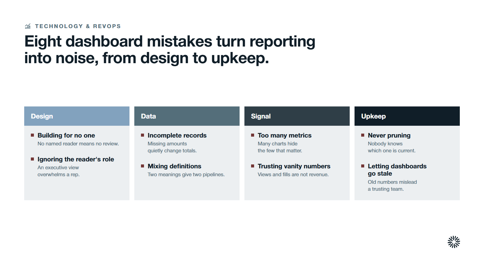
Most HubSpot dashboards fail for the same few reasons.
- Tracking too many metrics. Twenty charts hide the three that matter. Cut anything that does not change a decision.
- Building for no one. A dashboard without a named reader gets no review.
- Reporting from incomplete records. Missing amounts, close dates and associations quietly change every total.
- Mixing definitions. Two meanings of qualified lead produce two versions of the pipeline.
- Trusting vanity numbers. Page views and form fills are early signals, not revenue outcomes.
- Never pruning. Existing dashboards pile up, so no one knows which one is current.
- Ignoring the reader's role. A dashboard that suits an executive overwhelms a rep, and the other way round.
- Poor visualization choices. A chart type that hides the trend obscures the insight it was built to show.
- Letting dashboards go stale. Outdated numbers mislead a team that trusts the screen.
What you gain when this is done properly
When HubSpot dashboards are built by role on clean data, the weekly meeting is about decisions instead of whose number is right. Every team that touches revenue benefits.
Sales gets a clear view of where deals stall
Sales managers see which stage of the sales process holds the most time and which loss reasons repeat. Reps open one view and know their next action. Clear visibility into performance metrics increases accountability without a status meeting. Coaching starts from the sales process itself, not from anecdotes.
Marketing can show what it contributed to revenue
Marketing teams move budget toward sources that produce customers and away from those that only produce leads. Reporting to leadership happens in revenue terms, which protects the spend that works when budgets tighten. Shared dashboards also bridge the communication gap between marketing and sales, because both read the same numbers.
Customer success sees the accounts that need attention
Customer success reads service metrics next to the account's deal and renewal history. They also learn which sources and promises bring customers who stay, which improves customer retention.
Make dashboards part of your go-to-market system
HubSpot dashboards pay off when the data underneath is trusted, the metrics are defined, and someone reviews them on a schedule. The dashboard is the last step of that chain, not the first, and it turns CRM data into actionable insights only when the earlier steps hold.
Propello designs and builds connected go-to-market systems on HubSpot for CEOs and revenue leaders at growing B2B companies, and Propello is a HubSpot partner. If your dashboards exist but your team does not use them, an audit is the place to start.
