If you lead marketing or revenue at a B2B company, a call to action (CTA) is the instruction that moves a visitor from reading to doing: book a call, download a guide, start a trial. A good one names a single desired action, in plain words, at the moment the reader is ready for it. Without one, readers often leave without completing the task the page was built for, because the CTA bridges passive reading and active engagement.
This guide is for marketing and sales leaders, founders and the people who build pages, emails and ads. You get six steps with a finish line for each, call to action examples you can adapt and the mistakes that quietly cut conversion rates in digital marketing.
|
Call to Action A short prompt, usually a button or link, that tells a reader the one specific action to take next and what they get by taking it. |
What you will have at the end
You will end up with a small, working system for every page that matters.
- One main CTA for each page, email and ad, each tied to a stage of the customer journey.
- Button text built from an action verb and an outcome, written in your buyer's words.
- A placement and design plan that works on mobile devices as well as desktop.
- A test plan with a single measure per CTA, so you know which version deserves to stay.
What to have in place before you start
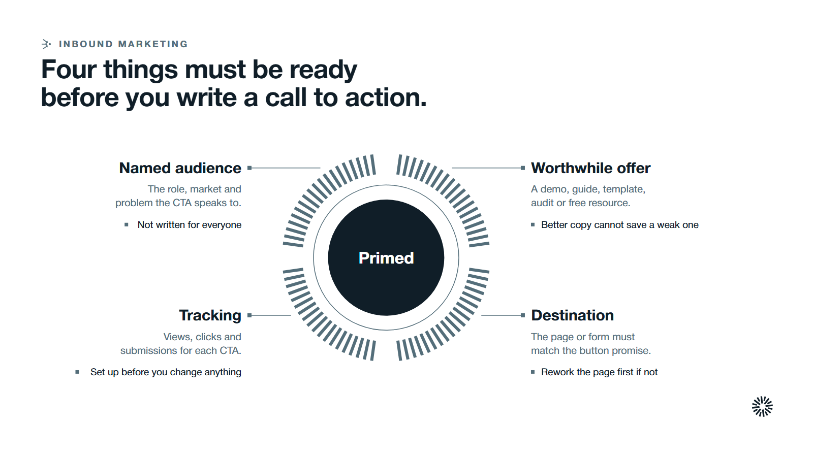
A CTA only works if the page around it makes sense. Check these four things first.
- A named target audience. Know the role you are writing to, the target market they sit in and the problem they came with. A CTA written for everyone persuades no one.
- An offer worth the click. A demo, guide, template, audit or free resource that a buyer would value. If the offer is weak, better copy will not save it, and it should read the same across your marketing materials.
- A destination that finishes the job. The page or form behind the button should match the promise on the button. Rework the page first if it does not.
- Tracking. You need to see views, clicks and submissions for each CTA before you change anything.
The phrase has an older meaning outside this guide: in speeches, petitions and public campaigns, a call to action asks an audience to vote, donate or join. Here it means the prompt on a marketing page, email or ad.
Write and place a B2B call to action in six steps
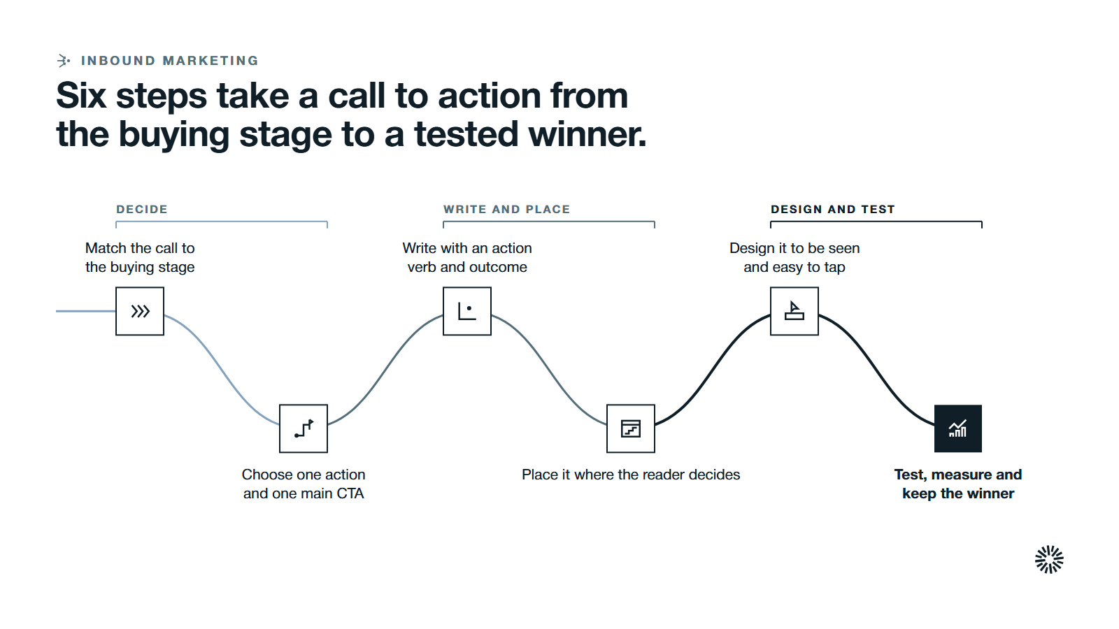
Work through the steps in order. Each ends with what done looks like.
1. Match the call to action to the buying stage
Start by asking where the reader is. Someone who just found a blog post is not ready to book a sales call, and someone comparing vendors does not want another beginner guide. Matching the ask to the stage is the biggest single lever you control.
B2B buying is also a group activity. Forrester's 2024 State of Business Buying found that on average 13 people within an organization are involved in the buying decision. That is why a CTA often has to serve the person who forwards the page, not just the person reading it.
Use the table as a starting point for call to action examples at each stage.
| Stage | What the reader wants | CTA example |
|---|---|---|
| Awareness | To understand a problem | Read the guide |
| Consideration | To compare approaches | Get the checklist |
| Decision | To judge fit and risk | Book a demo |
| Existing customer | To get more from what they bought | Join the onboarding session |
A soft CTA suits early readers because it encourages exploration and the cost of acting is low. A hard, direct action CTA suits readers who are ready to talk and drives the final step, and a limited special deal can suit a reader who needs a reason to act now. Offer more than one on the same page only when they are clearly ranked.
This stage thinking carries across the whole customer journey and every marketing campaign, from lead generation to renewal, and it guides users through the funnel one step at a time. For the full picture, read our complete guide to inbound lead generation.
You are done when every page, email and ad on your list has a stage and a desired action written next to it.
2. Choose one action and one main CTA per page
Decide what you want the visitor to do on this page and nothing else. A page that asks for a demo, a download and a share has no main CTA. Website visitors who face four choices often take none.
Pick the main CTA first. Then decide whether a quieter secondary option, such as a link to a related article, can sit below it without competing. Multiple CTAs on one page are fine when they point to the same action in different places, such as a button in the hero and the same CTA again at the end of the page.
On a landing page, remove navigation links that lead away from the offer.
You are done when you can say, in one sentence, the one thing this page asks a visitor to do, and every other link is clearly secondary.
3. Write the CTA copy with an action verb and an outcome
Good CTA copy is short and specific. It uses action oriented language: it begins with an action verb, says what happens next and uses the words your buyer uses. A CTA button that says "Submit" tells the reader nothing about what they get. The right CTA language mirrors how your potential customers describe the problem.
Use this pattern: verb, then the thing, then optionally the benefit.
- Weak: Click here. Submit. Learn more.
- Stronger: Get the pricing guide. Book a 30-minute strategy call. See how the integration works.
A label that names the thing, such as Get the pricing guide, tells the reader what they receive, which a generic label cannot. A short first step such as Join or Claim offer eases the worry of committing and can spark curiosity before the details appear.
Four habits help a powerful CTA encourage users to act and prompt users toward an immediate action:
- Use strong action verbs. Get, book, see, compare, download and start tell people what to do. Avoid vague ones like "explore."
- State the value. A clear value proposition on or near the button answers "why should I?" in a few words and carries your marketing message to the point of decision.
- Match the offer to the sign up. If the next step is to sign up for a webinar or a newsletter, say so in the label.
- Write in the first person where it fits. "Get my checklist" can feel more personal than "Get your checklist." Test it rather than assuming, and consider personalized CTAs for known contacts, since user behavior on your site tells you what each person has already seen.
Keep the label to a short phrase that can compel users toward further action without pressure. Save longer explanation for the line above the button. A sense of urgency works only when it is true: a real event date or a limited-seat workshop earns it, an invented deadline erodes trust.
For B2B, a good CTA is clear before it is clever. Avoid hype. Buyers who are weighing risk respond to clarity about what the next step costs them in time. "Book a 20-minute call" does more than "Don't miss out."
You are done when the label starts with an action verb, names the outcome in a few words and passes a read-aloud test: a stranger could say what will happen after the click.
4. Place the CTA where the reader decides
A CTA works when it appears right after the reader has been convinced of something. That usually means in three places: near the top of the page for readers who already know what they want, after the section that makes the case, and at the end of the page.
Each channel needs its own placement:
- Web page and blog post. On any web page, put the main CTA where the argument lands, and repeat it at the end. A blog post benefits from an inline CTA in the body plus a closing one.
- Inside content. A text CTA embedded in a paragraph works alongside a button CTA, because readers act on whichever fits the moment.
- Landing page. One offer, one form, one button. Place the CTA above the fold and again after the proof.
- Email marketing. In email campaigns, use one primary link or button, usually in the first screen, with the same wording as the landing page it opens.
- Paid social. Facebook ad CTAs and Instagram ad CTAs work the same way: the button label and the headline on the ad should promise what the landing page delivers, and site visitors who arrive should see that promise repeated.
- Pop-ups, slide-ins and welcome gates. These interrupt to different degrees: a slide-in is less disruptive than a pop-up, and a welcome gate that appears before the page content is the hardest to ignore. Use all of them sparingly. Exit intent pop ups should offer something helpful, not a repeat of the page.
Match the format to the context. In HubSpot, the calls-to-action tool can create button CTAs, banners and pop-ups. Its pop-up types include a banner fixed to the page, a pop-up box and a slide-in, and you can add a CTA to an external page once the HubSpot tracking code is installed.
You are done when each CTA sits at a decision point, the same CTA does not repeat within a single screen and the words match the destination.
5. Design the CTA so it is seen and easy to tap
Design supports the words; it cannot rescue vague ones. The key elements are contrast, size, space and a clear shape. A button should look like a button and stand apart from the surrounding text.
- Contrast. Use one color for the primary CTA and keep it for CTAs only. When everything is highlighted, nothing is.
- Size and space. Make the button large enough to tap with a thumb and leave empty space around it so it holds the user's attention.
- Visual elements. A small arrow or icon can guide users toward the action, but the text must still make sense alone.
- Mobile devices. Look at the page on a phone before you publish it. In HubSpot's CTA tool you can choose a responsive layout or hide the CTA on small screens.
If a CTA needs a form, ask for only what you need to deliver the offer. Every extra field is another reason to stop.
You are done when the CTA is the first thing a person notices in its section, is easy to tap on a phone and has enough contrast to read at a glance.
6. Test, measure and keep the winner
Treat each CTA as a hypothesis. Change one thing at a time: the label, the offer, the position or the color. Then test CTAs against the original for long enough to see a real difference, and keep the version that moves your chosen measure.
Pick the performance metrics that match the CTA's job, and watch user engagement beyond the click. For a button that opens a landing page, that is click rate. For a CTA that includes a form, that is submission rate. HubSpot's CTA analytics report views, clicks, click rate and submissions, and count only button or link clicks as clicks, so form interactions or video plays do not inflate the number.
Do not stop at the click. A CTA that attracts many clicks but few qualified conversations is the wrong CTA. Follow the contacts through to meetings and opportunities, as covered in what conversion rate optimization is, and judge each CTA on what it leads to.
You are done when each key CTA has a recorded measure, a baseline, a tested alternative and a decision about which version stays.
Mistakes to avoid when creating effective CTAs
Most weak CTAs repeat the same few errors.
- Asking for too much too soon. A demo request on a first visit is a big ask. Match the ask to the stage.
- Using vague labels. "Submit," "Click here" and "Learn more" do not say what happens next.
- Competing CTAs. Several buttons of equal weight split attention and lower the odds of any action.
- Promising one thing and delivering another. If the button says "Get the guide" and the page asks for a sales call, trust drops.
- Inventing urgency. False deadlines work once and then cost you credibility.
- Ignoring the phone. A button that is hard to tap on mobile devices loses readers who were ready to act.
- Measuring only clicks. A CTA is good only if the people who click go on to become pipeline.
What you gain when this is done properly
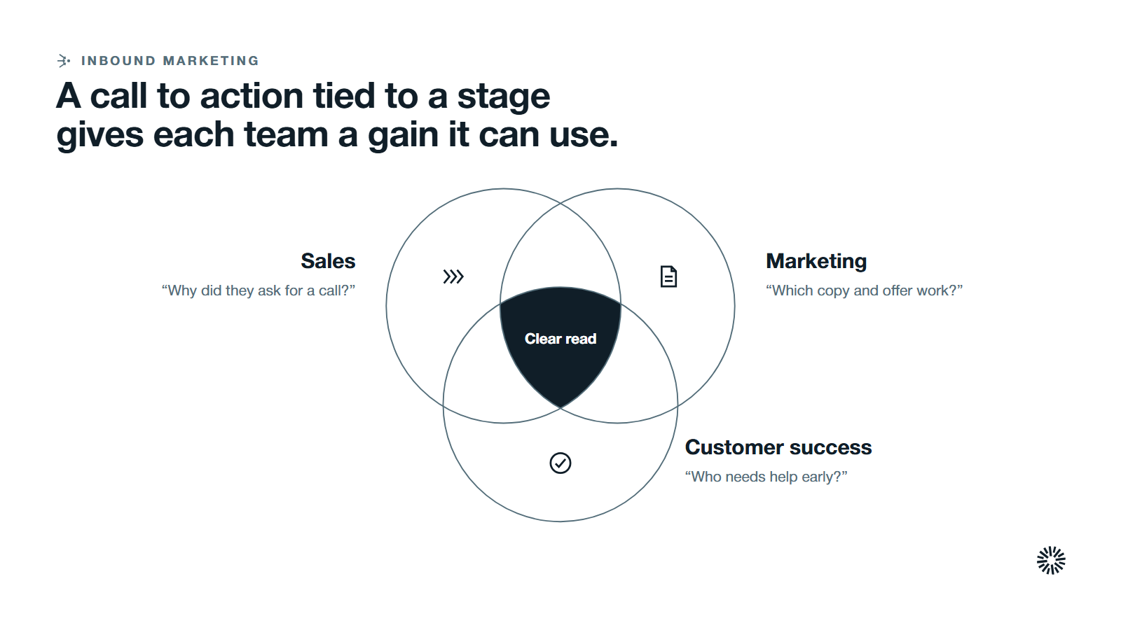
A clear CTA turns attention into conversations you can follow. Each team gains something different.
Sales gets better-qualified conversations
When each CTA matches a stage, the people who book a call know why they asked for it. Sellers start with context from the page, offer and form instead of a cold opening question.
Marketing gets a clear read on what works
With one main action per page and one measure per CTA, marketing can see which copy, placement and offer earn engagement. Budget and effort follow the evidence, not opinion.
Customer success gets a smoother handover
CTAs for existing customers, such as onboarding sessions and help guides, bring people into the right resources early. That helps new customers get value sooner and gives the team visible signals about who needs support.
Turn every page into a clear next step
A call to action is a promise and a request in one short line. Choose the stage, pick one action, write it with a verb and an outcome, place it where the reader decides, design it to be seen and test it against a baseline.
Propello designs and builds connected GTM systems on HubSpot. If your calls to action bring clicks but the data behind them is hard to trust or connect to pipeline, an audit is the place to start.